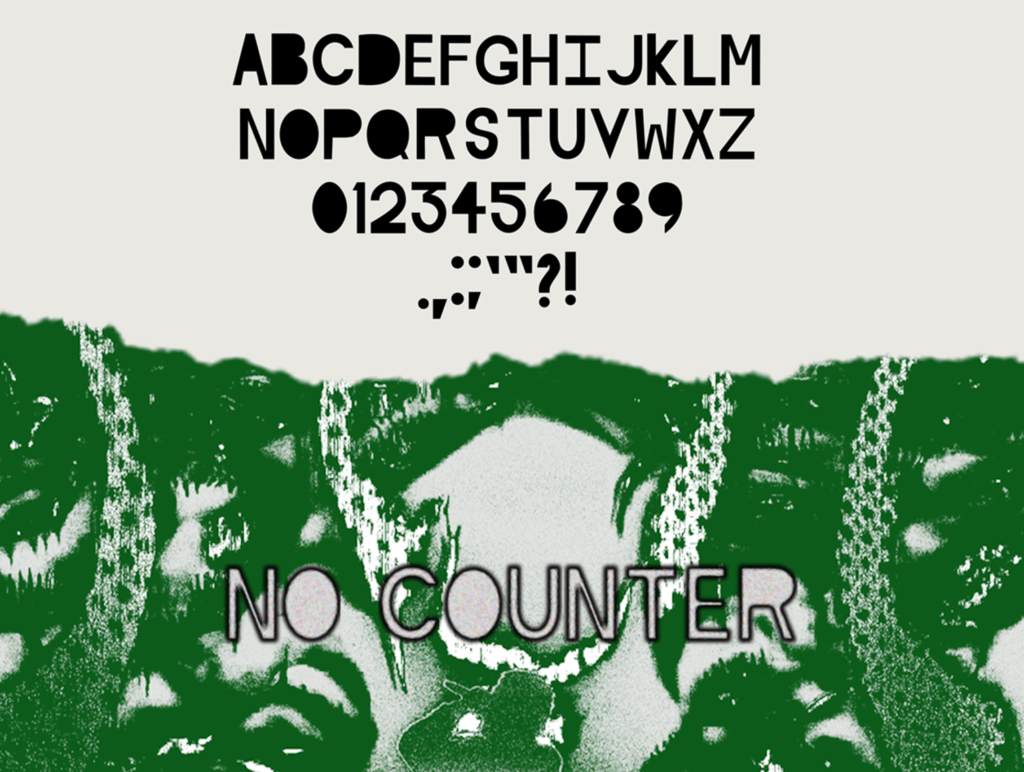
I created this font using Illustrator and then finalized it with proper kerning in Script. My professor assigned us the task of making our typeface, and even though I’m more into graffiti, I decided to expand my taste and create something different. I drew inspiration from David Carson, the mastermind behind Ray Gun magazine. However, it’s important to note that this font lacks a counter.
Audience
The typeface in question has been specifically created to cater to the needs of people who are drawn towards edgy and unconventional fonts. It is an ideal choice for individuals who are looking to add a unique touch to their creative projects, such as musicians and designers. The typeface’s distinct style and aesthetic appeal make it a popular choice among those who want to stand out from the crowd and make a bold statement with their work. Whether you’re designing a poster, creating a logo, or working on any other creative project, this typeface is sure to add a touch of edginess and creativity to your work.
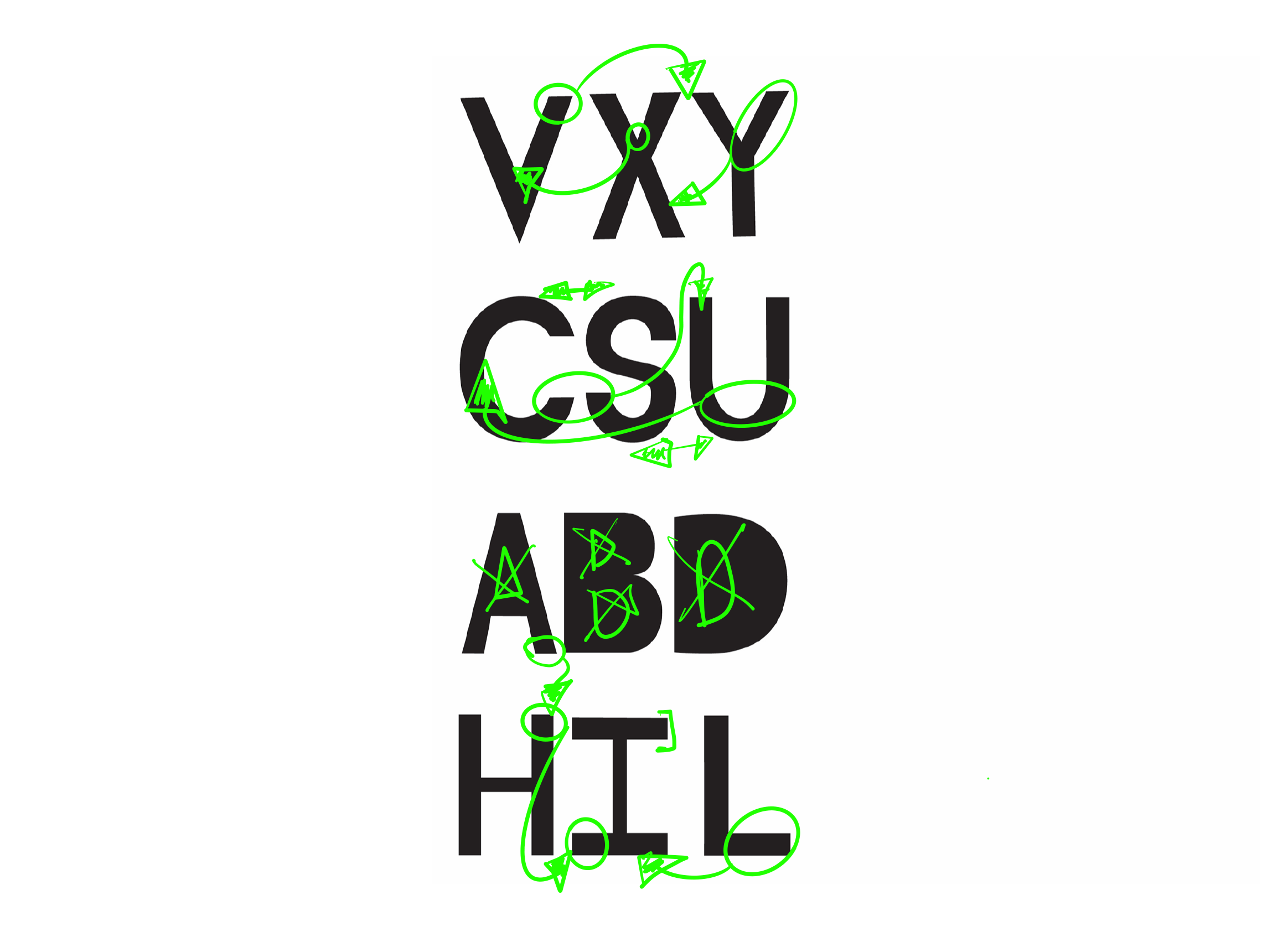
The V shares the same stroke as the Y, and the X, the X, and Y are made through the V.
The U is made by the C, and the aperture is the same curve, but the ending is what changes it. The S has the same feeling, yet the S is made to look out of place from the rest of the typeface.
The ABD and other letters are made from the H, and with a counter, they all have a similar stroke as the H. The kerning is made to be messed up, so the D and the B are further away.
I took inspiration from the Helvetica font. During my research, I noticed that Helvetica’s letter weights are consistent throughout the typeface, The I is an H on its side, and the L is the H with just two strokes.
Challenge
Typefaces serve different purposes, ranging from clarity to aesthetics and formality. However, the current selection of fonts is limited when it comes to breaking the traditional rules of typography. Minimalism is everywhere, and there is a demand for a typeface that embodies rebellion and non-conformity. Fonts are essentially a form of language, enabling communication with the audience. The objective is to create a font that challenges the norms and inspires a sense of rebellion.
Solution
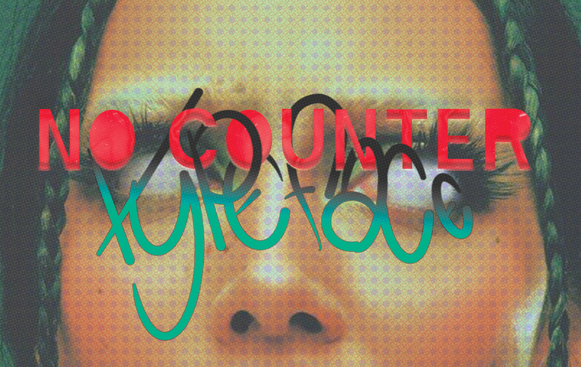
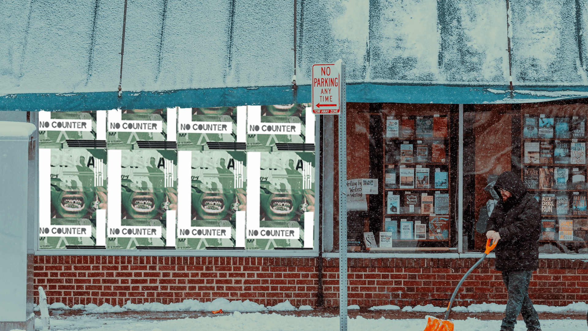
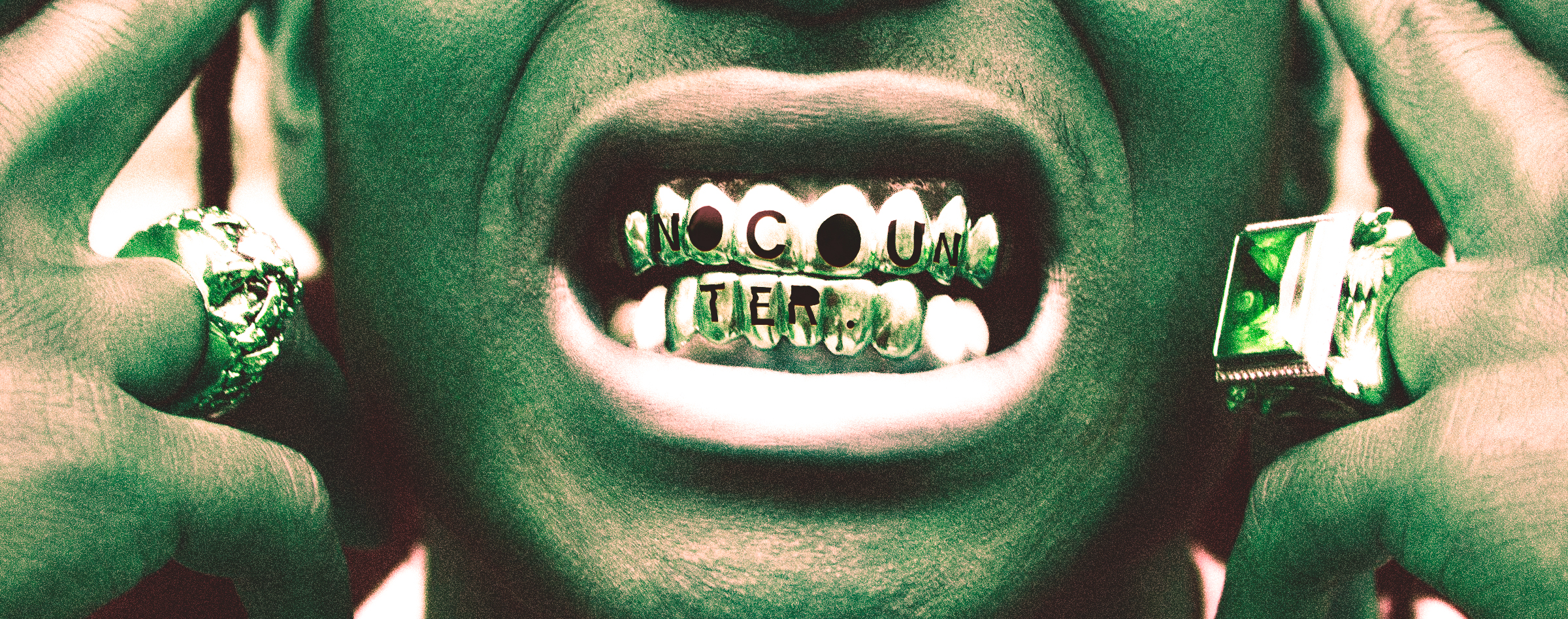
NO COUNTER is a one-of-a-kind font that challenges conventional typography norms. It is a sans-serif font that lacks any counters. The font style is bold and edgy, conveying a sense of anti-establishment. Some of the letterforms have thicker lines, while others are thinner, creating a visually dynamic effect. This is the solution I came up with for the given prompt.
Reflection
I am pleased with the level of detail put into this design, from the initial sketches to the final product. While working on it, I was inspired to push the boundaries of my creativity and explore new possibilities. Although I did not intend to revive the early 2010s aesthetic, I found that it worked well with the overall theme.