
Summary
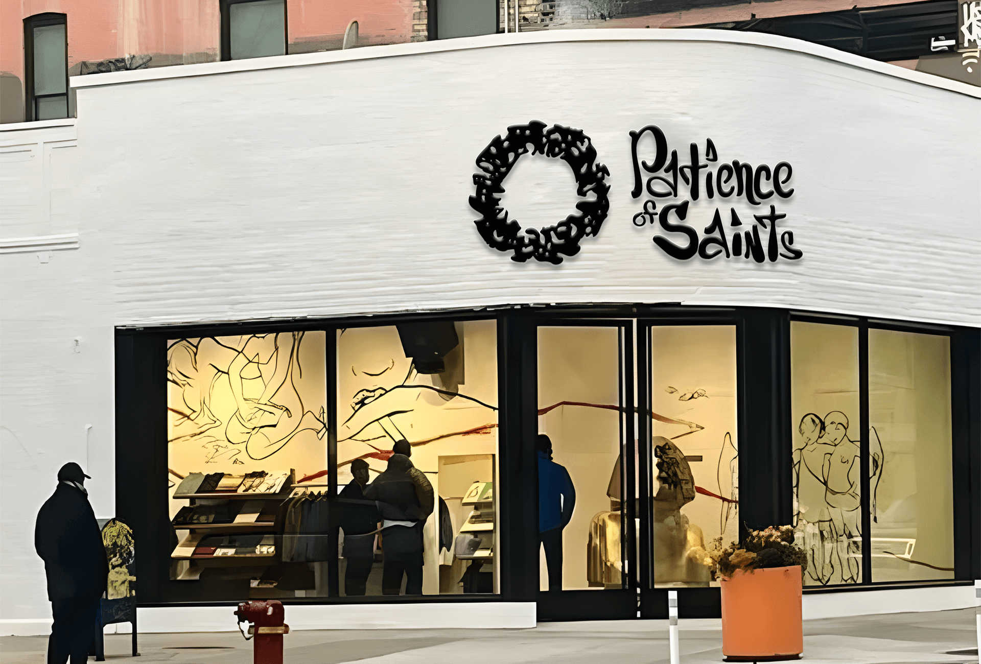
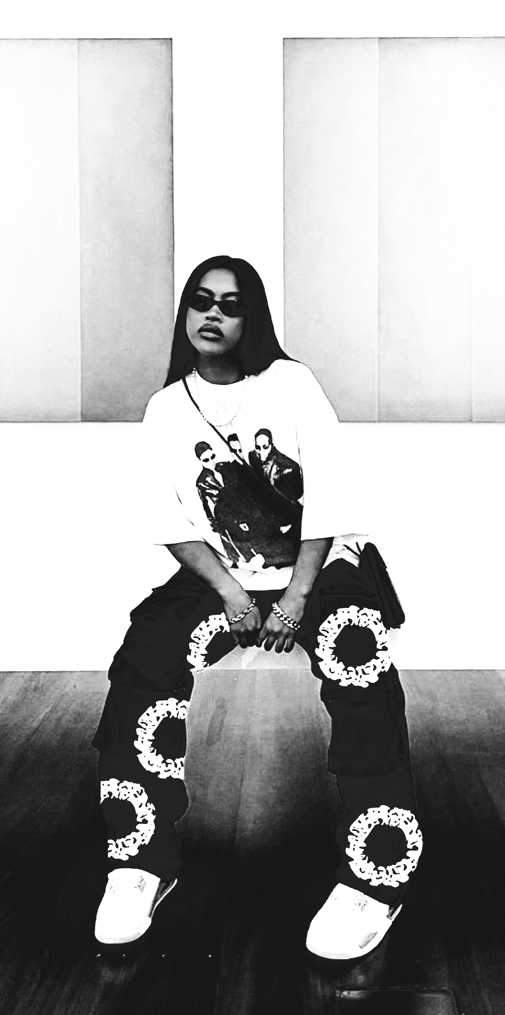
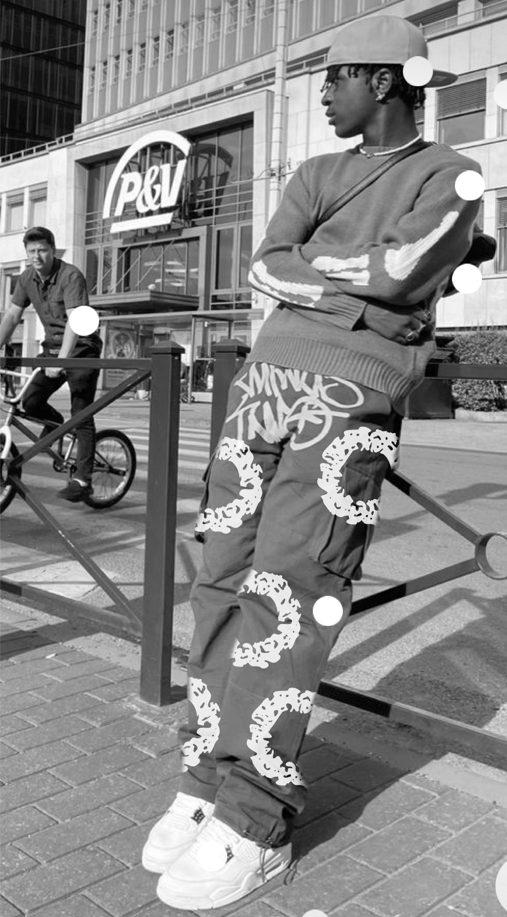
I established a streetwear brand named Patience of Saints. Streetwear was initially known as casual wear for urban youth, but it has evolved into a means for individuals to express their unique style. I founded the brand in Denver, CO during the Fall/Winter season of 2022. I utilized Illustrator to create the word mark after working on numerous sketches. Additionally, I designed the screen printing kit in Photoshop and outsourced its production to a contractor. Initially, the brand was created during my Identity and Systems class and later expanded upon in my integrated class.
Audience
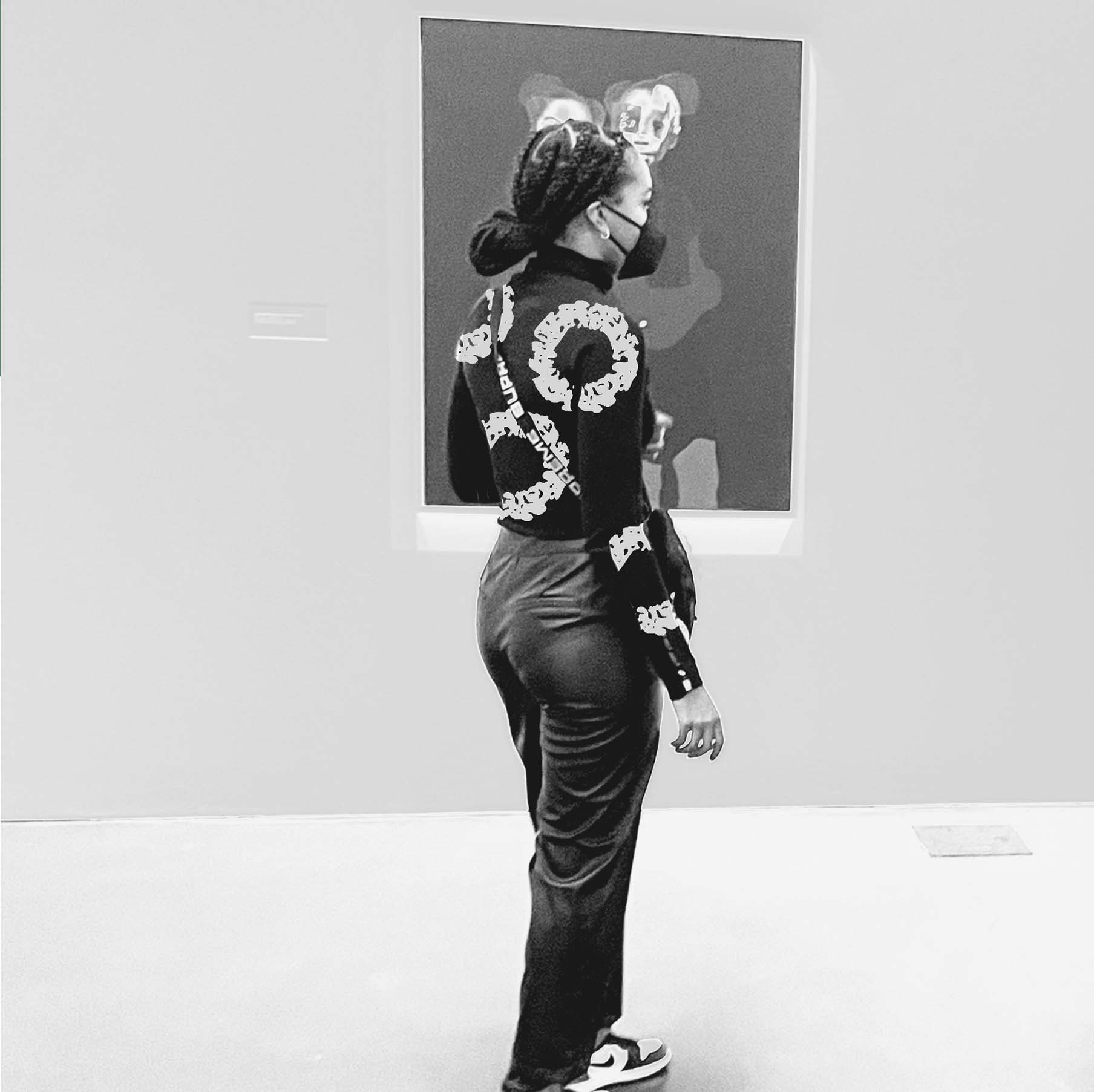
The target audience of Patience of Saints are individuals between the ages of 16 to 30 who have an interest in fashion and music.
Challenge
At first, I faced the challenge of developing a new brand that could connect with a specific audience and stand out in the market. In my Identity and Systems class, I was prompted to find a solution to a problem, and I noticed a significant issue with the streetwear industry. Despite being a fan of this genre, I found that new brands weren’t achieving much success. With Patience of Saints, my objective is to create a new landscape and revolutionize the way new brands are marketed. Additionally, I aim to provide a unique way for individuals to express themselves. Establishing the brand’s identity is one way to create a system.
Solution
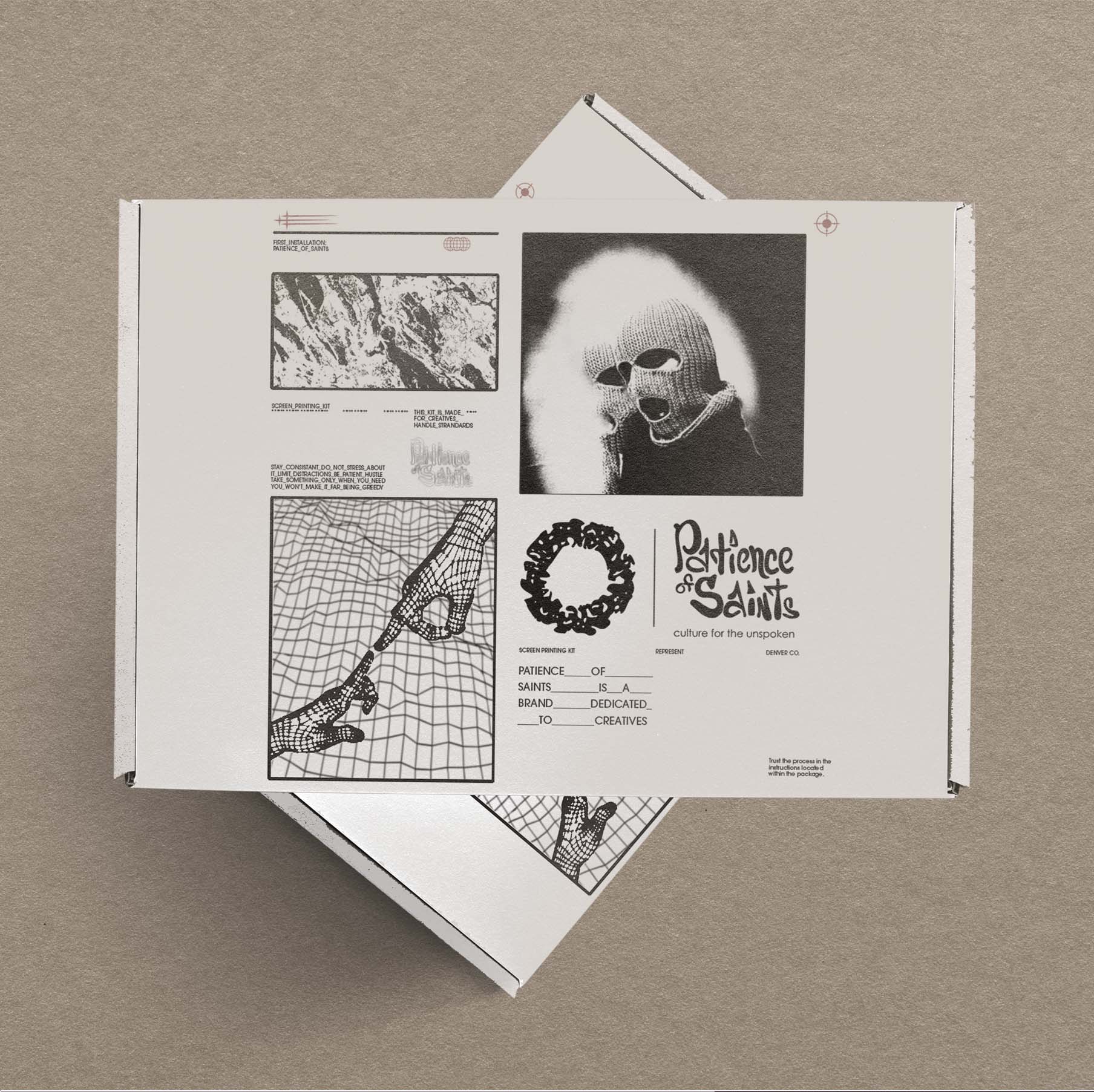
I came up with a unique solution for my brand, Patience of Saints, to establish its identity and system. I used my own handwriting for the letter mark and during my Integrated Design class, I devised a way to make the brand more distinctive and accessible. To achieve this, I created a screen printing kit that allows users to customize the brand according to their preferences. Unlike other typical streetwear brands, Patience of Saints strives to offer an experience to its users. With the screen printing kit, anyone can easily print the brand’s logo on any fabric, such as denim, hoodies, or t-shirts. The process of creating the screen printing kit equipped me with the necessary knowledge and confidence to design a unique mark for my brand.
Brand Standards
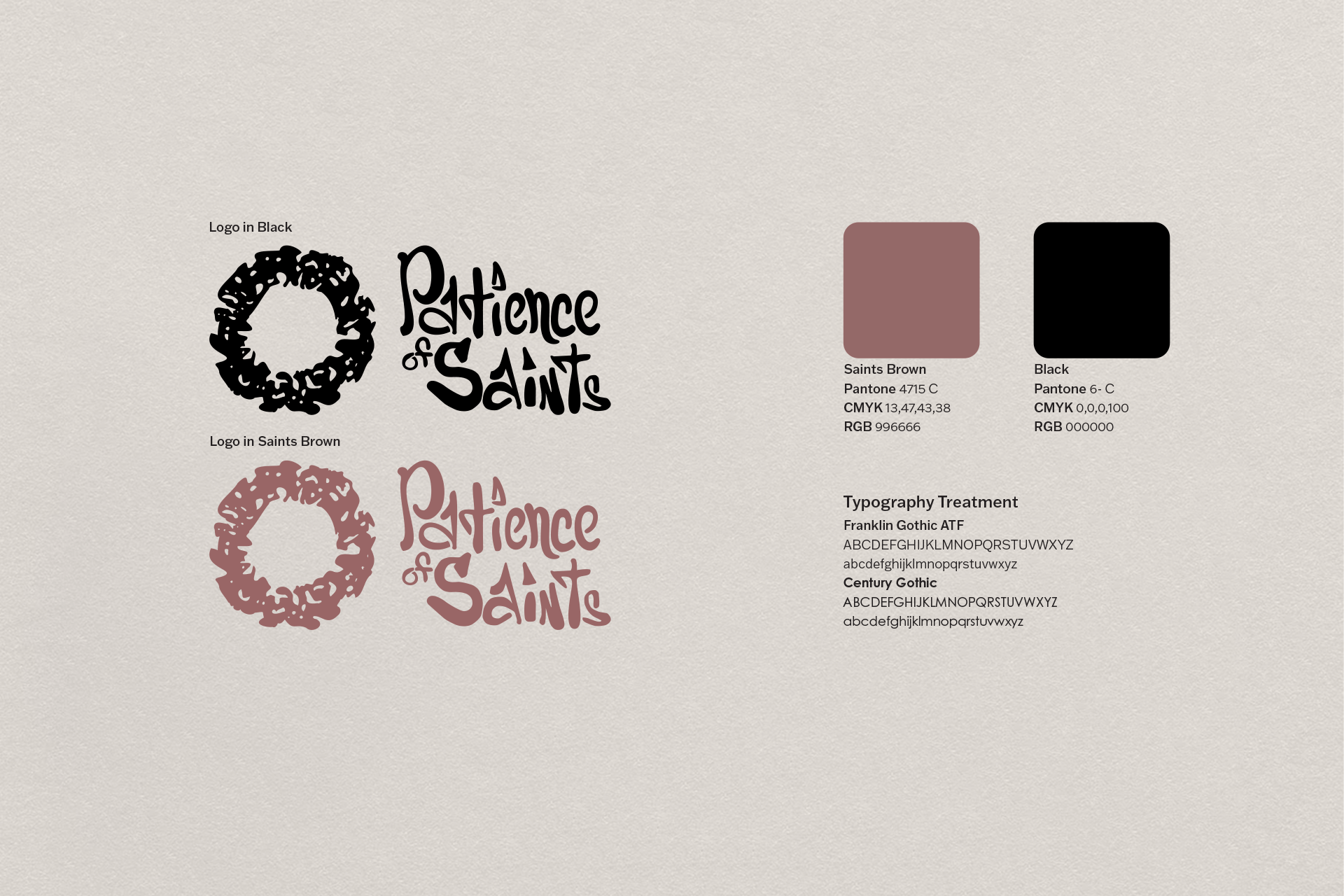
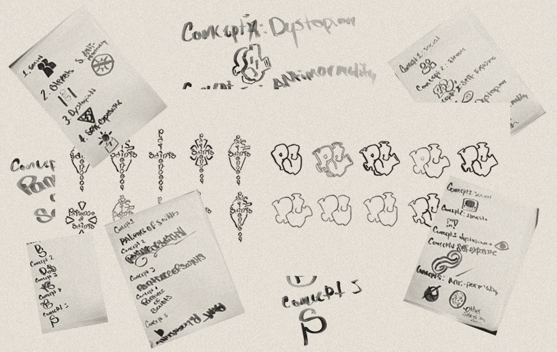
Before designing the Crown, I created the word mark for Patience of Saints. I had to repeatedly trace my handwriting. I went through many potential interactions, but only one was chosen. The name was inspired by Jerry Lorenzo’s Fear of God brand. Growing up as a Catholic, I realized that clothing and religion have a connection that can create a hybrid and a new myth for streetwear.
As a designer, I was inspired to create the “Patience of Saints” Crown logo one winter morning when I saw the ice on my windshield. I spun the design around and instantly knew it was going to work. Sometimes, as designers, we just have a gut feeling when we stumble upon something special.
When it came to selecting the color scheme for my brand, I had a clear vision in mind. During one of our classes, we went through a lot of Pantone colors until I finally came across Pantone 4715 C. I immediately decided to name it Saint’s Brown, as it represents the color of the robes that saints would wear. The colors are relevant to the brand by providing a signal of recognition, all of the other colors are taken, so why not have brown as the color for the brand?
I selected Franklin Gothic and Century Gothic as my preferred typefaces because their clean and simple design complements the messy handwriting used on the “Patience of Saints” word mark. The san-serif font provides the balance that the design requires, making it particularly effective.
Patience of Saints:
Screen Printing Kit
In my Integrated Production Technique class, I was tasked with designing packaging that would allow a brand to transition from the digital space to a do-it-yourself concept. The idea behind this was to create a more personalized experience for the consumer, where they could customize the design of the packaging to their liking. To achieve this, I came up with the concept of screen printing, which would allow individuals to print their own designs onto the packaging. This would not only give them the freedom to create a unique design, but also make the packaging more environmentally friendly by reducing waste. Overall, the project was a success and I learned a lot about the importance of creating a personalized experience for consumers in today’s market.

Take Aways
During the process of creating the word mark, I went through numerous iterations in search of the perfect one. Despite my efforts, I couldn’t find a suitable option until I decided to write “Patience of Saints” in my own handwriting. This simple action breathed life into the brand and made it feel authentic. Although there was still more work to be done on the rest of the assets, I wanted to emphasize how this particular task jump-started the project. And with that, the work came full circle.
Reflection
“I am pleased to report that this project received positive feedback from the branding and uniqueness panel of the business. It was an enjoyable experience to create it, and after receiving critiques and feedback from various individuals, I am confident that I can improve the mark by refining the strokes. Additionally, I am proud of the secondary mark that was created.”